
What if your AI assistant could create images?
Not generic stock photos or simple icons - but custom visuals that match your aesthetic, illustrate your ideas, and enhance your content. That’s what I built today: an Art skill for my Personal AI Infrastructure.
This post is a show-and-tell of the images Pal created in our first session together, including the prompts that generated them. No technical tutorial - just a visual journey through what’s now possible.
The First Test: A Glowing Circuit Board
After setting up the Gemini API integration, I asked Pal for a simple test image:
“a glowing circuit board in Tron style with neon orange and cyan accents”
The result? The header image above. A beautiful Tron-aesthetic circuit board with the exact color palette I wanted. The Art skill was working.
The Logo Challenge: Professional Branding
Next, I needed something practical: a logo for a friend who runs a consulting business, Meeker Technologies.
The prompt Pal crafted:
“Professional corporate logo design for ‘MT’ monogram (Meeker Technologies). Clean modern geometric lettermark combining M and T letters. Deep blue color (#2563eb) with subtle gradient to lighter blue (#3b82f6). Minimalist, sophisticated, technology consulting aesthetic. White background for versatility. Sharp clean lines, no hand-drawn elements. Professional business logo suitable for a technology consulting firm. Square format, centered composition.”
The result:
![]()
A clean, professional monogram that perfectly matches the site’s blue brand. From this, Pal generated the full favicon suite - 16x16, 32x32, 180x180 for Apple devices, and the traditional .ico format.
Blog Graphics: Visualizing Complex Ideas
Then came the real test: could Pal create diagrams that actually explain the technical concepts in my blog posts?
AI-Assisted Course Design
For my post about using AI to redesign a Python course, Pal needed to show the workflow from Canvas LMS through AI assistance to curriculum outputs.
The prompt:
“Hand-drawn sketch diagram in Excalidraw style on dark slate background (#1A202C). Shows AI-assisted course design workflow: a Canvas LMS icon on the left connecting via flowing arrows to a central AI brain/assistant element, which then outputs to curriculum elements (syllabus, assignments, GitHub logo) on the right. Rough wobbly white sketch lines. Neon orange (#FF6B35) glow on the AI brain. Cyan (#00D9FF) accent on GitHub icon. Educational technology theme. Minimal composition with generous negative space. Tron-meets-whiteboard aesthetic.”
The result:
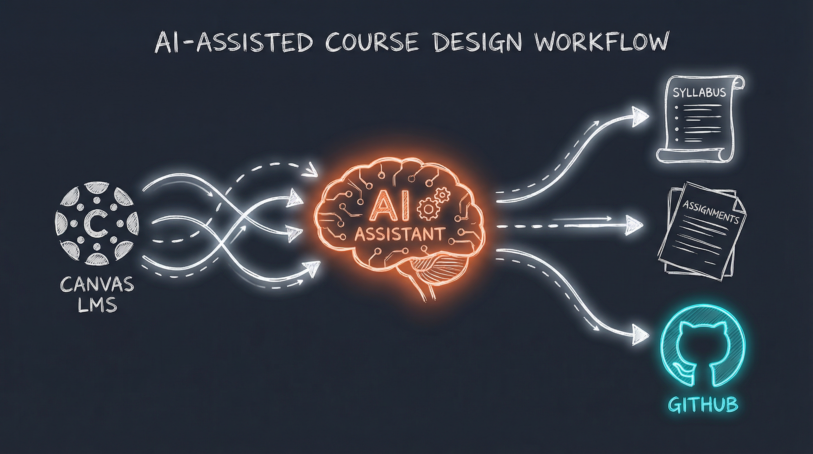
The workflow is immediately clear: Canvas on the left, AI in the middle (with that warm orange glow), and the outputs - syllabus, assignments, GitHub - on the right.
Family First AI
My post about building AI that helps with family life needed something warmer - technology serving human connection.
The prompt:
“Hand-drawn sketch in warm Excalidraw style on dark slate background (#1A202C). Family-first AI concept: Shows a simple family scene (stick figures of parent with two children) on the left, connected by flowing arrows to an AI assistant icon in the middle, which outputs to practical items (calendar, email envelope, activity suggestions). Warm neon orange (#FF6B35) glow on family figures. Soft cyan (#00D9FF) on AI element. Heartfelt but tech-enabled. White sketch lines. Minimal composition emphasizing the human connection. Title: ‘Family First AI’”
The result:
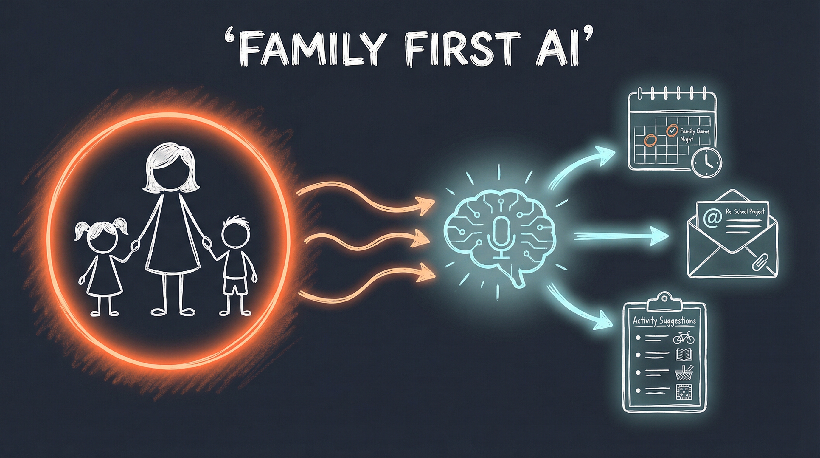
The family figures surrounded by that warm orange glow, flowing into the AI brain, which outputs to calendar, email, and activity suggestions. Technology in service of what matters.
Email Automation Architecture
The Outlook automation post needed a proper technical diagram showing the three-layer architecture.
The prompt:
“Hand-drawn technical architecture diagram in Excalidraw style on dark slate background (#1A202C). Email automation system: Three-layer stack showing Outlook icon at bottom (COM API), middle layer with MCP Server exposing tools (mail, calendar, tasks icons), top layer with AI Skill executing workflows. Arrows flowing upward showing data/control flow. White rough sketch lines. Neon orange (#FF6B35) glow on the AI layer. Cyan (#00D9FF) on Outlook icon. Clean technical diagram aesthetic. Labels: ‘Outlook COM’, ‘MCP Server’, ‘AI Workflows’. Title: ‘Email Automation Architecture’”
The result:
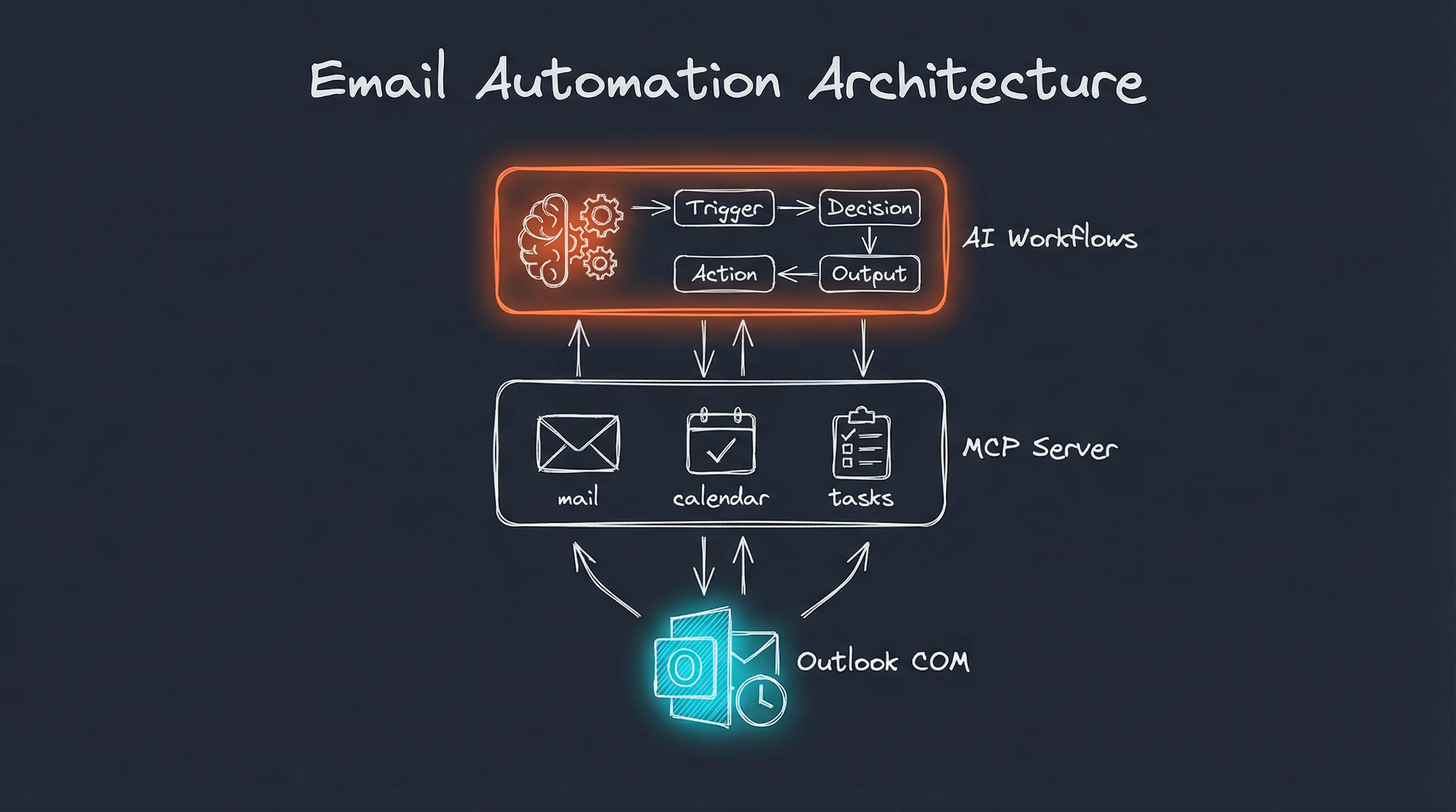
Three clean layers: Outlook COM at the bottom, MCP Server with mail/calendar/tasks in the middle, AI Workflows at the top. The architecture is immediately understandable.
PAI Skills System
Finally, my post explaining how PAI skills work needed a diagram showing the anatomy of a skill.
The prompt:
“Hand-drawn sketch diagram in Excalidraw style on dark slate background (#1A202C). PAI Skills system: Central hexagonal ‘SKILL’ module connected to four elements around it - ‘Triggers’ (lightning bolt), ‘Workflows’ (flowchart), ‘Context’ (document), ‘Tools’ (wrench). Shows modular, extensible architecture. White rough sketch lines. Neon orange (#FF6B35) glow on the central SKILL hexagon. Cyan (#00D9FF) accents on the surrounding elements. Simple, clear diagram showing how skills are structured. Generous whitespace. Title: ‘Anatomy of a PAI Skill’”
The result:
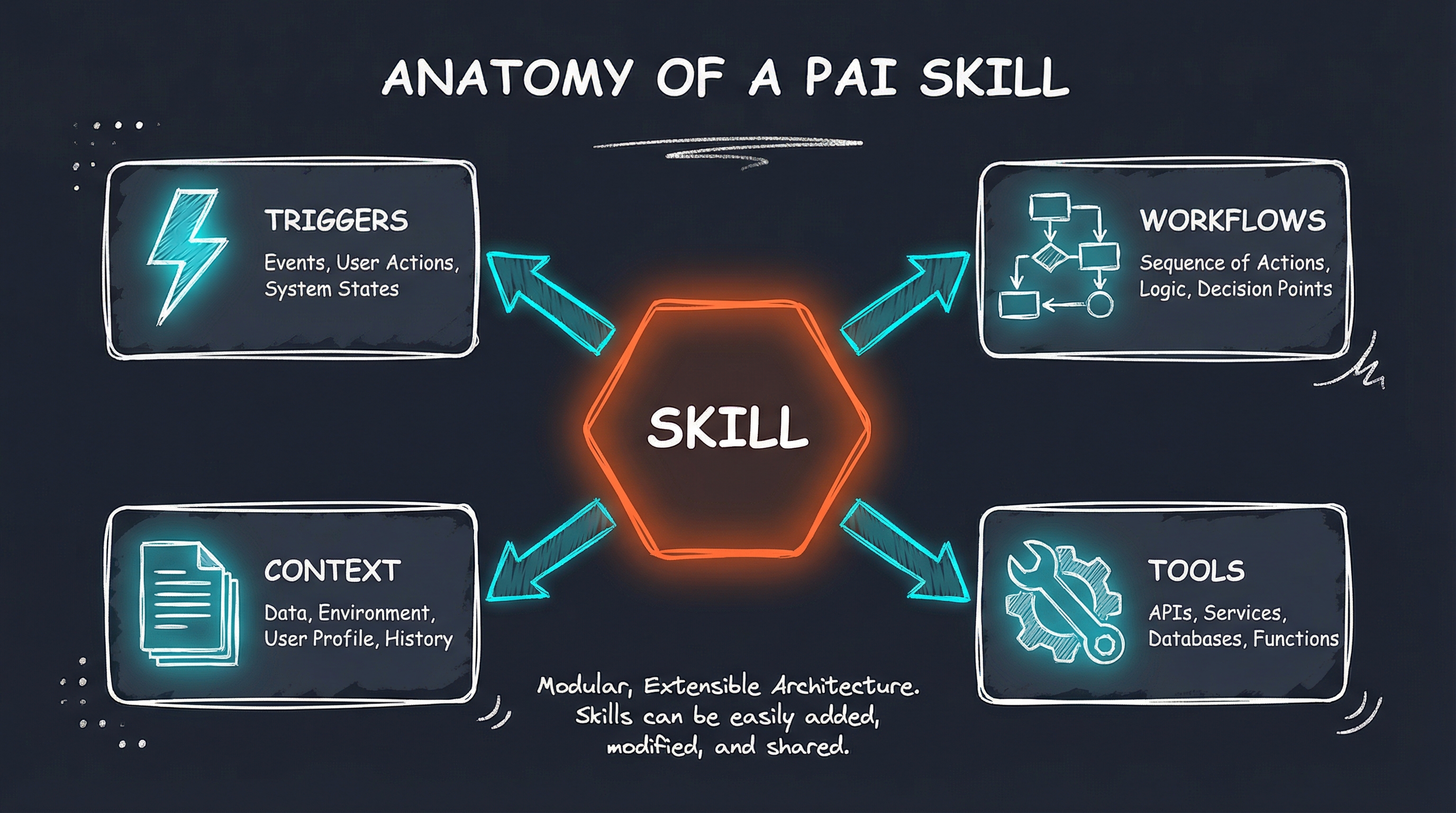
The central SKILL hexagon with its four components - Triggers, Workflows, Context, and Tools - arranged around it. The modular architecture is clear at a glance.
Personal AI Infrastructure Overview
For the intro post about PAI, Pal created an overview showing the layered architecture.
The prompt:
“Hand-drawn sketch diagram in Excalidraw style on dark slate background (#1A202C). Personal AI Infrastructure concept: A central terminal/CLI icon surrounded by expanding circles of capability - Memory, Skills, Tools, Integrations. White sketch lines showing connections. Neon orange (#FF6B35) glow on the central terminal. Cyan (#00D9FF) subtle accents on outer elements. Minimal composition, generous negative space. Tech diagram aesthetic like whiteboard sketch. Title: ‘Personal AI Infrastructure’”
The result:
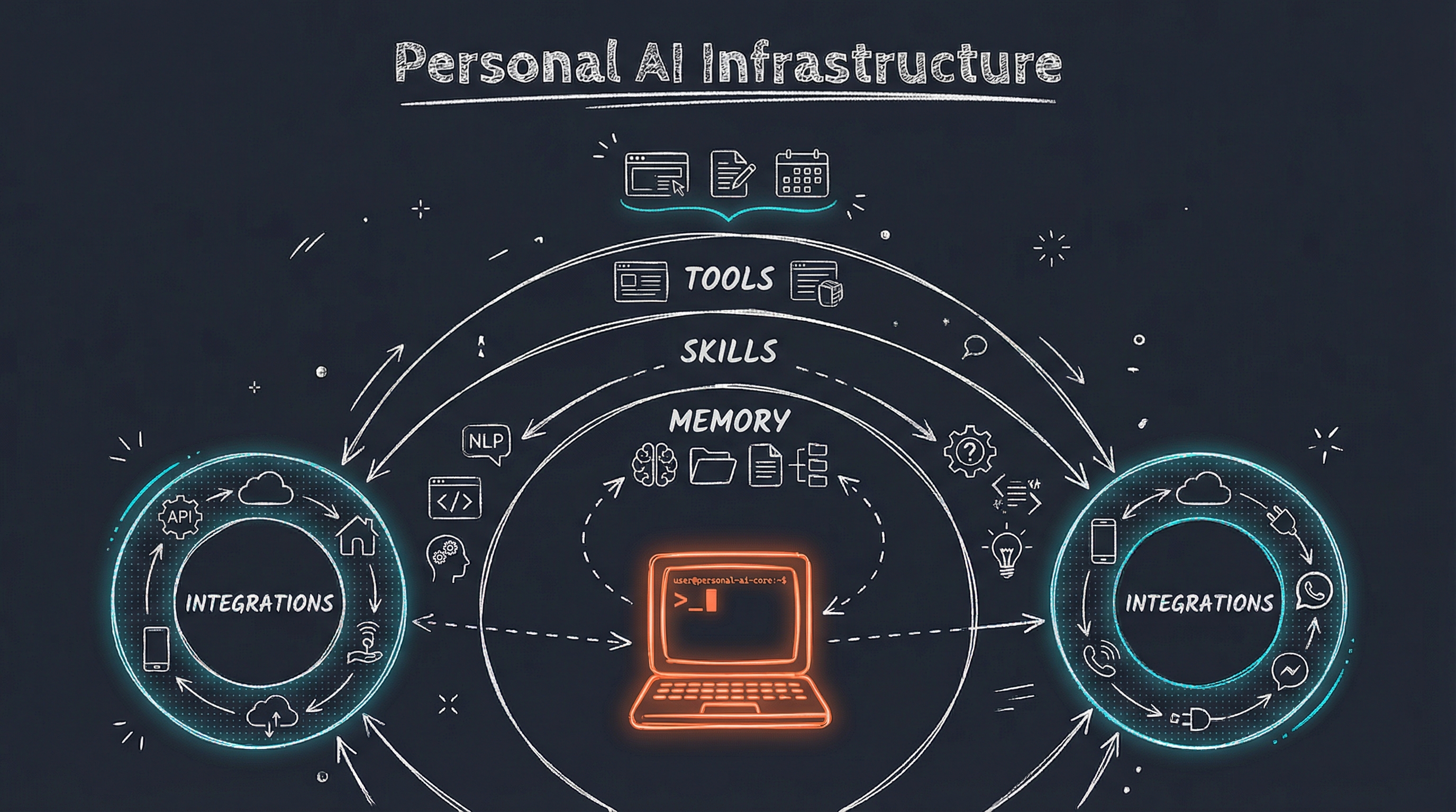
The terminal at the center (with its warm orange glow), surrounded by the expanding layers of capability: Memory, Skills, Tools, Integrations.
The Numbers
In a single session, Pal created:
- 1 professional logo with full favicon suite
- 6 blog header images explaining complex technical concepts
- 7 total images using the Gemini 3 Pro (Nano Banana) model
Each image took about 10-15 seconds to generate. The entire visual overhaul of my blog and business site happened in under an hour.
The Aesthetic
All the blog graphics follow a consistent visual language Pal calls the “PAI Aesthetic” - a Tron-meets-Excalidraw style:
- Dark slate backgrounds (#1A202C) for modern contrast
- Hand-drawn sketch lines that feel approachable, not corporate
- Neon orange accents (#FF6B35) for warmth and energy
- Cyan highlights (#00D9FF) for technical sophistication
- Minimal composition with generous negative space
It’s a style that feels both technical and human - exactly what I want for content about Personal AI Infrastructure.
What This Means
Having an AI that can create images on demand changes how I think about content:
No more stock photo hunting. When I need a visual, I describe what I want and Pal creates it.
Consistent branding. Every image follows the same aesthetic because it’s built into the skill.
Complex ideas visualized. Technical architectures and workflows that would take hours to diagram in Figma now take seconds.
Iteration is cheap. Don’t like an image? Regenerate with a different prompt. The cost is fractions of a cent per image.
The Prompts Are the Product
Notice something about the prompts above? They’re detailed, specific, and intentional. Pal didn’t just ask for “a picture of AI” - it constructed prompts that specified:
- Exact colors and hex codes
- Compositional elements and their arrangement
- Style references (Excalidraw, Tron, whiteboard)
- Negative space and visual balance
- Specific glows and accents
The Art skill includes knowledge about the PAI aesthetic, so Pal knows how to construct these prompts automatically. I just say “create a header image for my email automation post” and Pal handles the rest.
Teaching my AI to create images turned out to be one of the highest-leverage additions to my Personal AI Infrastructure. In the time it would have taken me to find and customize a single stock photo, Pal created custom visuals for my entire blog.
That’s the power of AI that knows you. It doesn’t just execute tasks - it understands your aesthetic, your needs, and your context. And now it can show you what it’s thinking.
Interested in building your own Personal AI Infrastructure? I help individuals and organizations design AI systems that actually fit how they work. Get in touch if you’d like to explore what’s possible.